
SAMPLE OF WORK
Over the years, we've learned that showcasing all our work at once is impossible, so we’ve handpicked a selection to give you a glimpse of what we can achieve together at Emerger. If you connect with our vibe but don’t see exactly what you’re looking for, reach out. We can curate a portfolio tailored to your business challenge and industry. Rest assured, we have something relevant to share!

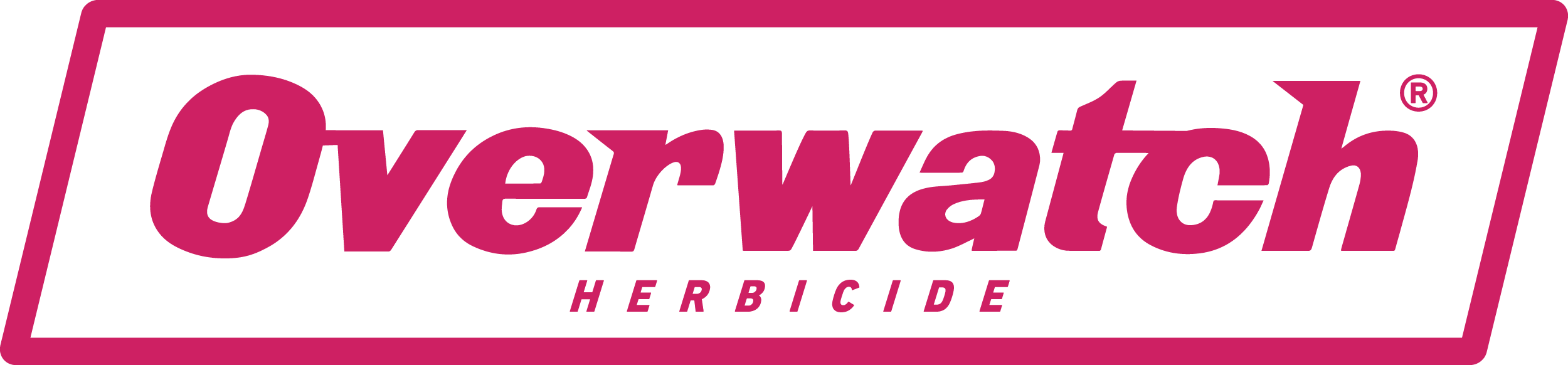
FMC: OVERWATCH®

FMC needed to name, brand and launch a new herbicide into the largest agricultural market in the country; wheat, barley and canola. The brand identity we created also needed to have global relevance.
-
Let's start where it ended...
The ending was nothing short of spectacular. FMC sold out the first allocation of product - three times the budgeted amount. This marked the most successful launch in FMC’s global history.
Our multi-channel marketing campaign delivered remarkable results, reaching 98% of our target market. By the time Overwatch was available, not only had they heard of it, but they also understood the value it would bring to their farming operations. There was no ambiguity about what Overwatch was. Our negotiated media spots provided more than triple the value we paid for.
Over the course of the next three years we continued to evolve the campaign to maintain market traction.
Now, let’s dive into the how it all began...
Positioning
We conducted an in-depth analysis of market competitors, both in Australia and abroad, as well as successful agricultural and challenger campaigns worldwide. The majority of advertising in this space was uninspired—pale, male, and stale. The typical imagery of an aging white male in a paddock, standing behind a ute with a drum and a dog, was outdated. We needed a more relevant and modern approach.
Naming
We sought a name that communicated the product’s benefits—watching over a farmer’s largest investment. It needed to resonate with our target market and work across multiple languages. Additionally, it had to be globally ownable. After considering a shortlist of over 20 names, we recommended Overwatch® Herbicide, which was approved by the global marketing and brand team.
Brand Identity
Our brand identity had to reflect both the product and its outcomes. Overwatch creates a distinctive magenta hue in treated crops due to its signature bleaching effect. We chose this magenta as the brand’s primary color to ensure in-paddock and on-shelf recognition.
This insight also inspired our campaign tagline: See the difference in the paddock. The tagline highlights the visual signature, superior efficacy, higher yield, and the new mode of action that addresses resistance, particularly in ryegrass.
To modernize the conversation and reflect the diversity of contemporary Australian farming, we featured a strong female agronomist and a younger farmer in all campaign assets. The black-and-white images, accented with magenta blocks of color and creative hand symbols, were designed to disrupt the market, grab attention, and cut through the cluttered conversation.
Campaign
Launching a new agricultural product involves long lead times—registration and approval are required before selling can begin. However, waiting until then to build a brand would have jeopardized the success of launching a new product in the same season. Farmers needed a reason to trust that this new product would work.
Our approach was three-phased:
Teaser Campaign
Registration Announcement
Buy Now
Marketing Strategy & Media Buying
Our strategy and media buying approach centered on three key objectives:
Launch with Impact: As a new product, we needed to ensure our target market knew about Overwatch® Herbicide before the key sales period. We bought media across six channels (Regional TV, Regional Radio, Google AdWords, YouTube, Facebook, and Twitter) and aggressively promoted the product’s unique selling points. This ensured our media hit very specific regions at the right times, ahead of the key sales period.
Convert Pre-Registrations into Sales: To turn mass market awareness into sales over 12 months, we partnered with FMC to ensure a seamless onboarding experience—from initial product awareness to pre-registration, and finally, to product availability in the market. This process was designed to be engaging, consistent, and deeply informative.
Enhance FMC’s Brand Recognition and Recall: Running such a large campaign across multiple channels, including TV, significantly improved FMC’s brand reputation and recall. To capitalize on this increased awareness and traffic, we included a series of brand posts on social media to highlight FMC’s history and values.
Services Provided: Channel strategy, media schedule negotiation, production and delivery of assets to all partners, as well as ongoing monthly reporting and optimization of schedules to ensure maximum value.
“Having Emerger partner with us has been invaluable. Their seniority, expertise and ability to deliver outcomes to our business is second to none. They have partnered with us on the delivery of our biggest product launch in history and in doing so have been proactive and gone above and beyond to work within our timeframes and sometimes complex international requirements. We will continue to work with Emerger for many years to come.”
So much pink!!! We needed to make the identity relevant to the product and the outcome. Overwatch created signature bleaching within a crop, creating a magenta hue in treated crops so we decided to use this as a primary colour for the brand to drive recognition in paddock and on the shelf. That same insight also led to our campaign tagline: see the difference in the paddock.


DIVERGER

ASX listed company Easton Investments acquired a suite of businesses and soon realised their expansion plans under the Easton name, brand and branding no longer made sense.
-
Brand Workshops
We conducted a series of research and individual brand workshops with key leaders across the five businesses within Easton Investments. Our goal was to uncover what made each entity unique while identifying the common threads that connected them all.
From these workshops, we distilled the unifying DNA elements and highlighted what made each business in the portfolio distinctive. These insights would be the foundation for their future positioning.
As we progressed, it became evident that aligning Easton Investments' new strategic direction and vision required a fresh name and brand. This would not only reflect their current beliefs and vision for success but also create a cohesive identity across their portfolio.
By having the right people involved in our workshops, we ensured that the decision to rename and rebrand was met with strong support and enthusiasm.
Naming
Through a meticulous process involving naming workshops, master lists, IP checks, and testing, Diverger was chosen as the new name. A new name can significantly impact a business when it aligns with the company’s identity, future direction, and desired market position—or it can be just superficial change. The success ratio depends on how well internal alignment matches the new name and how effectively the brand’s story is communicated externally.
Naming a business is a science, and we employ a specific formula to create a shortlist of names and score them, allowing businesses to understand what will work—not just what they prefer.
Branding
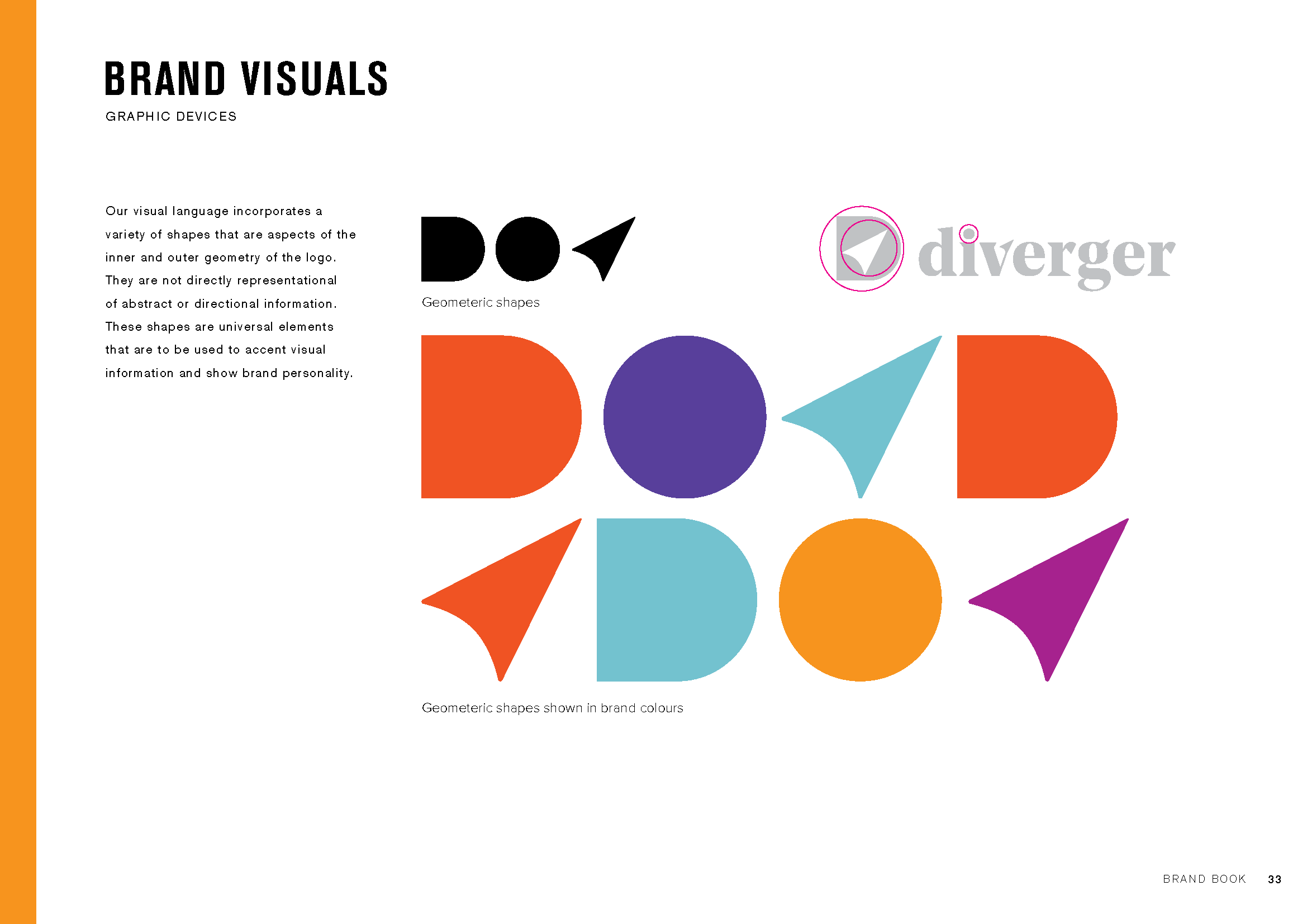
To complement the new Diverger name, we needed a brand identity that embodied its meaning: divergent thinking, visualizing the big picture, and organizing smaller details into a cohesive whole. This had to be expressed through design, language, and the conduct of the people within the business.
We also redefined the brand architecture, aligning all other brands within the portfolio to demonstrate their collective strength. We subtly unified the portfolio by incorporating the D navigation logo across all brands.
Website
When ASX investors first hear about a tax and advisory group shaking up the industry, where do they go? The web. And how quickly do they judge the business’s quality based on its online presence? Instantly.
Diverger needed a website that communicated their new vision and innovative approach to the industry. They also wanted to tell their brand story more effectively, ensuring that it was presented with simplicity and elegance.
We designed a website that fulfilled these needs, providing key messaging and carefully curated brand images to bring Diverger’s vision to life visually.


“When we reformed the board, management and growth strategy for Easton Investments, it was critical to re-launch the company to the market with a refreshed identity that stood out from the pack. Our partnership with Emerger was critical to this process and creating the new Diverger name and brand identity has really allowed us to stand out from our peers and carve a new message to the market. I was pleased to hear from a competitor recently that they had completed a competitor brand review and concluded ours was the best brand positioning in the market. ”


