DIVERGER
ASX listed company Easton Investments acquired a suite of businesses and soon realised their expansion plans under the Easton name, brand and branding no longer made sense.
-
Brand Workshops
We conducted a series of research and individual brand workshops with key leaders across the five businesses within Easton Investments. Our goal was to uncover what made each entity unique while identifying the common threads that connected them all.
From these workshops, we distilled the unifying DNA elements and highlighted what made each business in the portfolio distinctive. These insights would be the foundation for their future positioning.
As we progressed, it became evident that aligning Easton Investments' new strategic direction and vision required a fresh name and brand. This would not only reflect their current beliefs and vision for success but also create a cohesive identity across their portfolio.
By having the right people involved in our workshops, we ensured that the decision to rename and rebrand was met with strong support and enthusiasm.
Naming
Through a meticulous process involving naming workshops, master lists, IP checks, and testing, Diverger was chosen as the new name. A new name can significantly impact a business when it aligns with the company’s identity, future direction, and desired market position—or it can be just superficial change. The success ratio depends on how well internal alignment matches the new name and how effectively the brand’s story is communicated externally.
Naming a business is a science, and we employ a specific formula to create a shortlist of names and score them, allowing businesses to understand what will work—not just what they prefer.
Branding
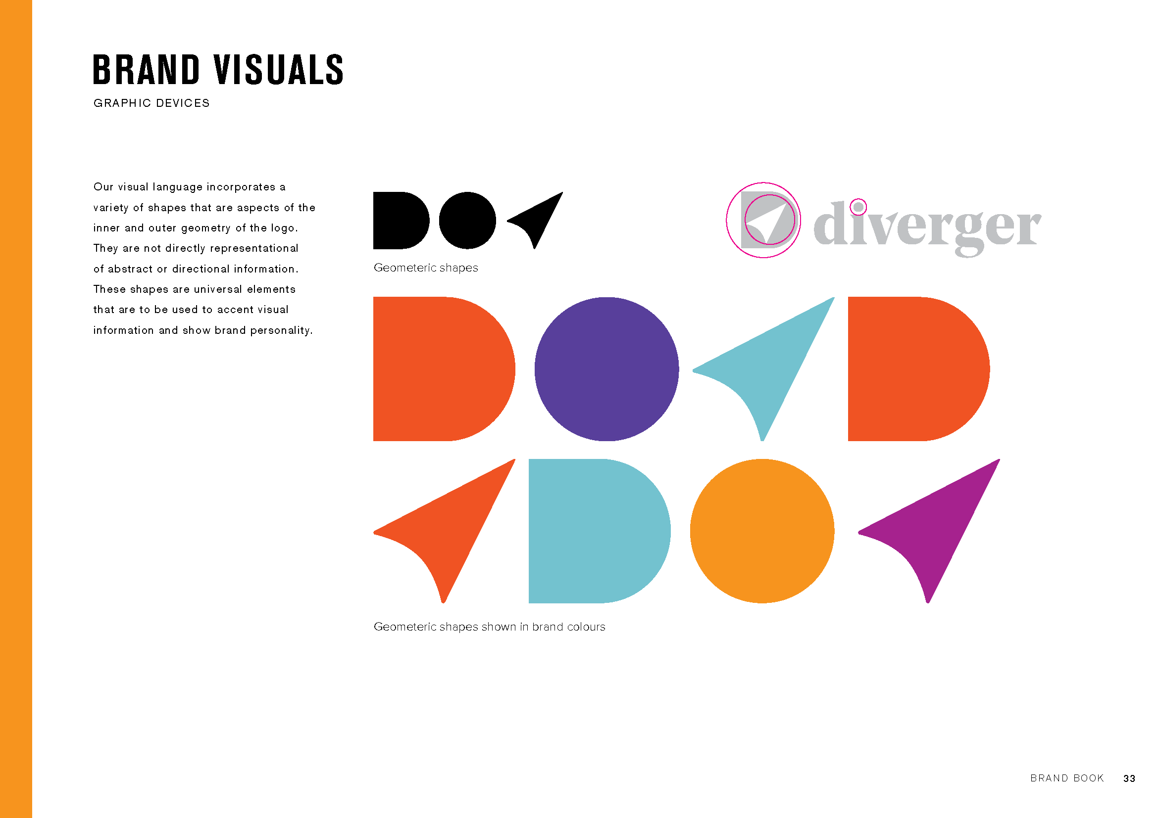
To complement the new Diverger name, we needed a brand identity that embodied its meaning: divergent thinking, visualizing the big picture, and organizing smaller details into a cohesive whole. This had to be expressed through design, language, and the conduct of the people within the business.
We also redefined the brand architecture, aligning all other brands within the portfolio to demonstrate their collective strength. We subtly unified the portfolio by incorporating the D navigation logo across all brands.
Website
When ASX investors first hear about a tax and advisory group shaking up the industry, where do they go? The web. And how quickly do they judge the business’s quality based on its online presence? Instantly.
Diverger needed a website that communicated their new vision and innovative approach to the industry. They also wanted to tell their brand story more effectively, ensuring that it was presented with simplicity and elegance.
We designed a website that fulfilled these needs, providing key messaging and carefully curated brand images to bring Diverger’s vision to life visually.
“When we reformed the board, management and growth strategy for Easton Investments, it was critical to re-launch the company to the market with a refreshed identity that stood out from the pack. Our partnership with Emerger was critical to this process and creating the new Diverger name and brand identity has really allowed us to stand out from our peers and carve a new message to the market. I was pleased to hear from a competitor recently that they had completed a competitor brand review and concluded ours was the best brand positioning in the market. ”


