
SAMPLE OF WORK
Over the years, we've learned that showcasing all our work at once is impossible, so we’ve handpicked a selection to give you a glimpse of what we can achieve together at Emerger. If you connect with our vibe but don’t see exactly what you’re looking for, reach out. We can curate a portfolio tailored to your business challenge and industry. Rest assured, we have something relevant to share!

LONGREACH PLANT BREEDERS

Transforming Grower Behaviours to Secure End Point Royalties
LongReach Plant Breeders is Australia’s leading wheat breeding company and the largest share farmer in the country. Their business relies on End Point Royalties (EPRs); fees that growers pay when they sell their wheat. However, with tens of millions of dollars in unpaid royalties, the future of wheat breeding in Australia was at risk. A creative solution was needed to motivate growers to change their behaviours and meet their contractual obligations.
-
Consumer Research
To understand the underlying issues, we conducted extensive research and interviews with growers, key stakeholders, and grower groups. Our goal was to uncover perceptions of the EPR system, the payment process and growers' understanding of its value.We identified several key insights:
Lack of Knowledge: Many growers were unaware of what would happen if royalties were not paid. The system was viewed as an "honesty box," despite licensing agreements being in place.
Process Confusion: The harvest declaration process was seen as difficult and time-consuming and a large proportion of growers mistakenly believed that EPRs were automatically deducted at grain silos.
Working closely with LongReach’s General Manager, senior leadership team, legal advisors and local teams, we developed a multi-channel messaging strategy. This strategy targeted growers of varying sizes and levels of understanding. Education was a key component - clearly communicating the consequences of unpaid EPRs and clarifying responsibilities.
Creative Assets
Our research revealed a sensitive truth: no farmer was willing to appear on camera to say their neighbours were "cheating the system," despite widespread frustration with non-compliance. To overcome this, we employed creative storytelling techniques:Actors & Emotional Triggers: We used actors to express how farmers who complied with EPR obligations felt about those who did not. By tapping into themes of mateship, loyalty and fairness, we created a compelling narrative that resonated with growers.
Trusted Ambassador: We engaged a relatable ambassador to simplify complex information, educate growers and encourage them to reach out to customer service for accurate declarations.
Human-Centred Content: We wrote, produced and directed content that addressed these insights, driving both emotional and rational appeals. Additionally, we partnered with one of Australia’s top up-and-coming photographers to capture powerful imagery that supported the campaign.
Email and Direct Mail
Leveraging Longreach’s database, over 7,000 growers were identified who may have believed EPRs were deducted automatically, or who failed to accurately declare their harvests. Our direct communications featured:Visually striking imagery
Links to education videos
Clear, legally grounded messaging tailored to the target audience
Website
We created a dedicated landing page and refreshed the entire website to align with the campaign messaging and asset CTAs. The landing pages served as the central hub, providing essential information and tracking campaign engagement. Visitors were directed to these pages through digital ads and direct mail campaigns.YouTube and Social Media
We produced engaging ambassador videos to demystify EPRs and help growers prepare for potential audits. In addition:Videos featured two growers addressing common misconceptions, providing relatable and authentic perspectives.
Content was distributed across Longreach’s social channels and boosted through paid media.
YouTube served as a platform for longer-form, educational content, while social media focused on driving quick, impactful engagement.
Initial Results
The campaign achieved remarkable outcomes within a short timeframe:2,000+ Phone Calls: The customer service team handled over 2,000 inquiries in the first 4 weeks of the campaign.
Immediate Revenue Impact: Small growers alone contributed over $400,000 in adjusted harvest declarations within the first 2 weeks and the campaign helped to drive more than $2.4M in recovered revenue.
Engagement Success: Social media and YouTube metrics demonstrated strong audience engagement, with significant reach and interaction.
Conclusion
Through deep consumer insights, strategic messaging and creative storytelling, we helped LongReach Plant Breeders shift grower behaviours, drive compliance and secure millions of dollars of critical EPR payments. This campaign not only helped to safeguard the company’s future, but also reinforced its role as a trusted partner in Australia’s wheat industry.
CREATIVE DIRECTION
Brand imagery: Evoke strong emotions with authentic, heroic visuals that reflect the real spirit of the business and the industry. Capture powerful portraits and action shots that resonate.

“Within a month of launching this campaign we had more than 2,000 calls from growers responding to our request for updated information. The inital response exceeded every one of our expectations and the quality of the work Emerger does is amazing. We have now recovered $2.4M of unpaid royalties as a result of running this campaign - we have had a remarkable result!”


"Gifted" Assets to Australian Crop Breeders (ACB): To strengthen the impact of the EPR campaign, we recognised the importance of securing support from Australian Crop Breeders (ACB). However, ACB indicated they were unable to produce their own campaign assets. In response, LongReach made a strategic decision to "gift" a portion of our campaign assets to ACB. This included a curated selection of six videos featuring growers, while ambassador-focused content remained exclusive to the LongReach brand. By providing ACB with ready-to-use assets, we ensured their involvement, adding industry credibility to the message and amplifying the campaign's reach and seriousness in market.
-
Brand Strategy Workshop
Over the course of a half day workshop we were able to redefine LongReach’s beliefs, personality traits, purpose and vision to reflect where the company was headed. This process became a celebration of not only the direction the business is steering towards, but also of the people driving it. This workshop and the outcomes gave us the ideal foundation for creatively evaluating the best brand position and creative strategy to bring the business’ refined brand DNA to life.
Positioning & Creative Strategy
We wanted LongReach to stand apart from the traditional “consumer focused” vision of golden wheat fields and harvesters by showing the grit, detail, personalities and hard work that the industry requires to succeed. By sharing LongReach’s beliefs, connection to farming and unique differences as part of our campaign messaging, we connected the people and business to the success of Australian wheat farmers - and the future of Australian wheat farming.
Creatively, we used close-up shots, drone footage, periphery work and evidence of the long term relationships/partnerships that drive the business’ success, to stand out from the crowd and capture the hearts and minds of our target market.


RIO TINTO: INDIGENOUS LEADERSHIP

In the past decade, we have interviewed over 800 employees in mining. Of those interviews, proudly more than 50% were for our work in the Indigenous space. This has included having conversations with Traditional Owners and Indigenous Community Elders about the things that matter to them most. This work has given us an unparalleled and deep understanding of the need for inclusivity and diversity for Indigenous People across all industries.
-
Rio Tinto made a commitment to increase Indigenous leadership within the organisation in order to improve strategic decision-making, change culture, help unlock the business value of relationships with Traditional Owners and help chart the future direction of the business.
After such a significant incident in 2020 their biggest challenge was how to authentically regain trust and at the same time attract, retain and grow Indigenous talent within the organisation.
Research
We worked hard to collect the dots before we tried to connect them. We spent countless hours interviewing both Indigenous and non-Indigenous employees to understand their felt experience within the organisation.
We knew from this research that we needed to do some truth telling and acknowledge the pain people were feeling in the business through story telling post Juukan Gorge. We also knew we needed to do a better job of telling the stories of the incredible Indigenous leaders within the business who believed the company had what it takes to achieve success and drive change from the inside out.
Brand Development
We created a brand for Indigenous Leadership within Rio Tinto that empowered the mission and set high expectations for all involved; acting as a badge of pride to drive forward the social change and business transformation the team is committed to achieving.
Our handcrafted logo was designed by Indigenous artist Lynicce Church, from the Ngunnawal, Wiradjuri and Kamilaroi tribes. The meaning is embedded into the design and acts as more than a mark - it is by nature a symbol of change for the business.
Finally, each of the colours in our final palette represent core elements of country; Pilbara red for the richness of the earth and the depth of the work being done to change, black for commitment, bright blue for the sky and endless opportunities, green for the colour of trees and growth and sun yellow to symbolise energy.
We Feel & We're Changing Content
Strategy: Rio Tinto employees had not had a chance to talk openly about how they felt after the Juukan Gorge disaster in 2020. From our research, we knew that in order to build a new future with bright Indigenous minds and empowered employees we needed to deal with the now, be vulnerable and show how "we feel" as real people of Rio Tinto. We did this through a series of short stories and one long form video that humanised the response to Juukan Gorge and gave hope for the future. Getting senior leaders who were involved in the delivery to tell the story of what has been done (and is being done) would also be the most powerful way to showcase progress.
The We Feel & We're Changing videos were played at the 2021 AGM in London and were widely received as a hallmark for success when it comes to authentic storytelling within the business.
Cultural Connection Content
We partners with the Cultural Connection team to create all the video content to go within their online training platform; aimed at increasing cultural education and capability within the organisation.
Heritage Awareness Team
The Heritage Team came to us with a challenge to turn their online education content into a video series. We partnered with them to deliver a series of 10 videos that are now being used to educate new starters (as well as the wider business) on what, when, how, why and where cultural heritage awareness comes into play within the organisation.
Weipa Seeds
This project celebrates the partnership Rio has with Indigenous Traditional Owners and Community to rehabilitate the land on which the business operates.
Two-Way Mentoring
An incredible initiative that partners Rio Tinto leaders with rising Indigenous employees, offering both the mentor and mentee the opportunity a learning opportunity. This was delivered as a content series featuring the mentors and their mentees discussing the value exchange of the program.
The Indigenous Leadership logo was created by Indigenous artist Lynnice Church from the Ngunnawal, Wiradjuri and Kamilaroi Tribes.
The “I” represents a person and the beginning of their leadership journey.
The circle represents our collective culture as Indigenous people and the importance of coming together to listen, learn and share. This process of sharing builds individual, community and organisational leadership skills, knowledge and experience.
The “S” represents the continuation of the leadership journey where individuals take their learnings and implement them at work and in the community. It acknowledges that each person's journey is different and unique, but an effective leader is able to create a shared vision and bring people along the journey with them.


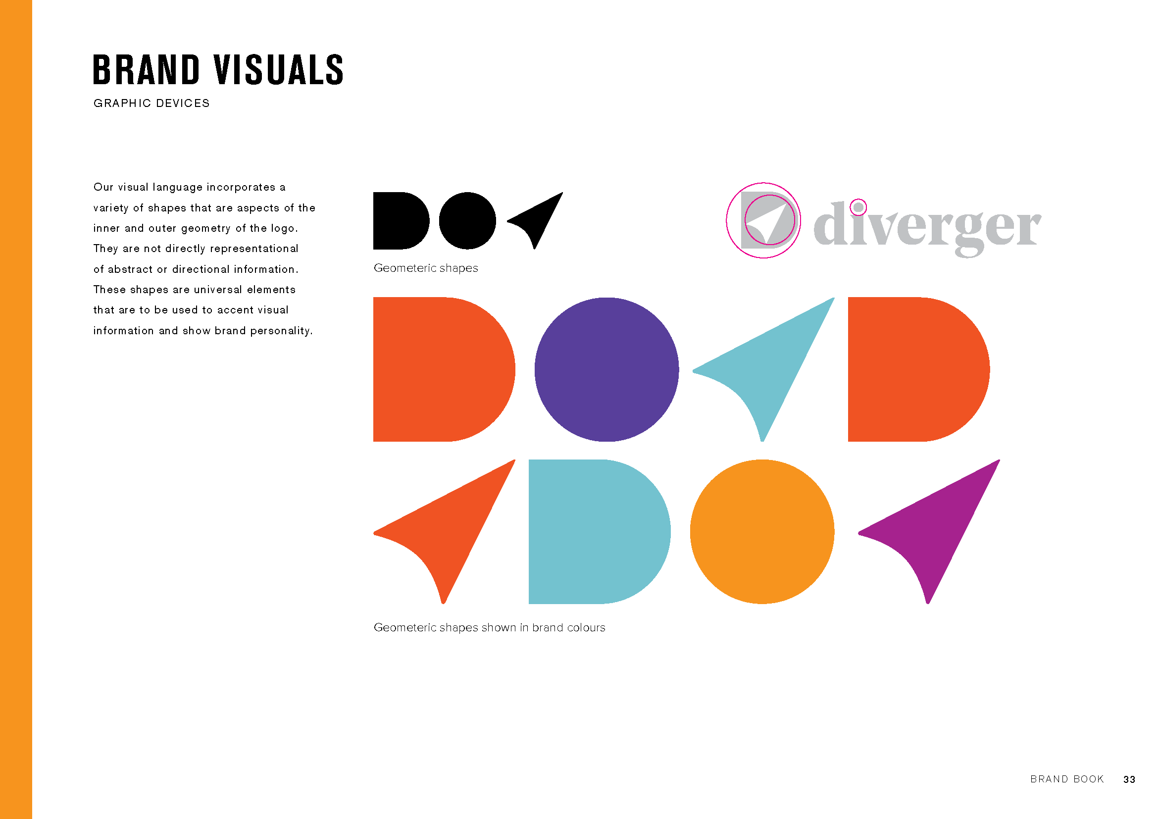
DIVERGER

ASX listed company Easton Investments acquired a suite of businesses and soon realised their expansion plans under the Easton name, brand and branding no longer made sense.
-
Brand Workshops
We conducted a series of research and individual brand workshops with key leaders across the five businesses within Easton Investments. Our goal was to uncover what made each entity unique while identifying the common threads that connected them all.
From these workshops, we distilled the unifying DNA elements and highlighted what made each business in the portfolio distinctive. These insights would be the foundation for their future positioning.
As we progressed, it became evident that aligning Easton Investments' new strategic direction and vision required a fresh name and brand. This would not only reflect their current beliefs and vision for success but also create a cohesive identity across their portfolio.
By having the right people involved in our workshops, we ensured that the decision to rename and rebrand was met with strong support and enthusiasm.
Naming
Through a meticulous process involving naming workshops, master lists, IP checks, and testing, Diverger was chosen as the new name. A new name can significantly impact a business when it aligns with the company’s identity, future direction, and desired market position—or it can be just superficial change. The success ratio depends on how well internal alignment matches the new name and how effectively the brand’s story is communicated externally.
Naming a business is a science, and we employ a specific formula to create a shortlist of names and score them, allowing businesses to understand what will work—not just what they prefer.
Branding
To complement the new Diverger name, we needed a brand identity that embodied its meaning: divergent thinking, visualizing the big picture, and organizing smaller details into a cohesive whole. This had to be expressed through design, language, and the conduct of the people within the business.
We also redefined the brand architecture, aligning all other brands within the portfolio to demonstrate their collective strength. We subtly unified the portfolio by incorporating the D navigation logo across all brands.
Website
When ASX investors first hear about a tax and advisory group shaking up the industry, where do they go? The web. And how quickly do they judge the business’s quality based on its online presence? Instantly.
Diverger needed a website that communicated their new vision and innovative approach to the industry. They also wanted to tell their brand story more effectively, ensuring that it was presented with simplicity and elegance.
We designed a website that fulfilled these needs, providing key messaging and carefully curated brand images to bring Diverger’s vision to life visually.


“When we reformed the board, management and growth strategy for Easton Investments, it was critical to re-launch the company to the market with a refreshed identity that stood out from the pack. Our partnership with Emerger was critical to this process and creating the new Diverger name and brand identity has really allowed us to stand out from our peers and carve a new message to the market. I was pleased to hear from a competitor recently that they had completed a competitor brand review and concluded ours was the best brand positioning in the market. ”


