
SAMPLE OF WORK
Over the years, we've learned that showcasing all our work at once is impossible, so we’ve handpicked a selection to give you a glimpse of what we can achieve together at Emerger. If you connect with our vibe but don’t see exactly what you’re looking for, reach out. We can curate a portfolio tailored to your business challenge and industry. Rest assured, we have something relevant to share!

LONGREACH PLANT BREEDERS

Transforming Grower Behaviours to Secure End Point Royalties
LongReach Plant Breeders is Australia’s leading wheat breeding company and the largest share farmer in the country. Their business relies on End Point Royalties (EPRs); fees that growers pay when they sell their wheat. However, with tens of millions of dollars in unpaid royalties, the future of wheat breeding in Australia was at risk. A creative solution was needed to motivate growers to change their behaviours and meet their contractual obligations.
-
Consumer Research
To understand the underlying issues, we conducted extensive research and interviews with growers, key stakeholders, and grower groups. Our goal was to uncover perceptions of the EPR system, the payment process and growers' understanding of its value.We identified several key insights:
Lack of Knowledge: Many growers were unaware of what would happen if royalties were not paid. The system was viewed as an "honesty box," despite licensing agreements being in place.
Process Confusion: The harvest declaration process was seen as difficult and time-consuming and a large proportion of growers mistakenly believed that EPRs were automatically deducted at grain silos.
Working closely with LongReach’s General Manager, senior leadership team, legal advisors and local teams, we developed a multi-channel messaging strategy. This strategy targeted growers of varying sizes and levels of understanding. Education was a key component - clearly communicating the consequences of unpaid EPRs and clarifying responsibilities.
Creative Assets
Our research revealed a sensitive truth: no farmer was willing to appear on camera to say their neighbours were "cheating the system," despite widespread frustration with non-compliance. To overcome this, we employed creative storytelling techniques:Actors & Emotional Triggers: We used actors to express how farmers who complied with EPR obligations felt about those who did not. By tapping into themes of mateship, loyalty and fairness, we created a compelling narrative that resonated with growers.
Trusted Ambassador: We engaged a relatable ambassador to simplify complex information, educate growers and encourage them to reach out to customer service for accurate declarations.
Human-Centred Content: We wrote, produced and directed content that addressed these insights, driving both emotional and rational appeals. Additionally, we partnered with one of Australia’s top up-and-coming photographers to capture powerful imagery that supported the campaign.
Email and Direct Mail
Leveraging Longreach’s database, over 7,000 growers were identified who may have believed EPRs were deducted automatically, or who failed to accurately declare their harvests. Our direct communications featured:Visually striking imagery
Links to education videos
Clear, legally grounded messaging tailored to the target audience
Website
We created a dedicated landing page and refreshed the entire website to align with the campaign messaging and asset CTAs. The landing pages served as the central hub, providing essential information and tracking campaign engagement. Visitors were directed to these pages through digital ads and direct mail campaigns.YouTube and Social Media
We produced engaging ambassador videos to demystify EPRs and help growers prepare for potential audits. In addition:Videos featured two growers addressing common misconceptions, providing relatable and authentic perspectives.
Content was distributed across Longreach’s social channels and boosted through paid media.
YouTube served as a platform for longer-form, educational content, while social media focused on driving quick, impactful engagement.
Initial Results
The campaign achieved remarkable outcomes within a short timeframe:2,000+ Phone Calls: The customer service team handled over 2,000 inquiries in the first 4 weeks of the campaign.
Immediate Revenue Impact: Small growers alone contributed over $400,000 in adjusted harvest declarations within the first 2 weeks and the campaign helped to drive more than $2.4M in recovered revenue.
Engagement Success: Social media and YouTube metrics demonstrated strong audience engagement, with significant reach and interaction.
Conclusion
Through deep consumer insights, strategic messaging and creative storytelling, we helped LongReach Plant Breeders shift grower behaviours, drive compliance and secure millions of dollars of critical EPR payments. This campaign not only helped to safeguard the company’s future, but also reinforced its role as a trusted partner in Australia’s wheat industry.
CREATIVE DIRECTION
Brand imagery: Evoke strong emotions with authentic, heroic visuals that reflect the real spirit of the business and the industry. Capture powerful portraits and action shots that resonate.

“Within a month of launching this campaign we had more than 2,000 calls from growers responding to our request for updated information. The inital response exceeded every one of our expectations and the quality of the work Emerger does is amazing. We have now recovered $2.4M of unpaid royalties as a result of running this campaign - we have had a remarkable result!”


"Gifted" Assets to Australian Crop Breeders (ACB): To strengthen the impact of the EPR campaign, we recognised the importance of securing support from Australian Crop Breeders (ACB). However, ACB indicated they were unable to produce their own campaign assets. In response, LongReach made a strategic decision to "gift" a portion of our campaign assets to ACB. This included a curated selection of six videos featuring growers, while ambassador-focused content remained exclusive to the LongReach brand. By providing ACB with ready-to-use assets, we ensured their involvement, adding industry credibility to the message and amplifying the campaign's reach and seriousness in market.
-
Brand Strategy Workshop
Over the course of a half day workshop we were able to redefine LongReach’s beliefs, personality traits, purpose and vision to reflect where the company was headed. This process became a celebration of not only the direction the business is steering towards, but also of the people driving it. This workshop and the outcomes gave us the ideal foundation for creatively evaluating the best brand position and creative strategy to bring the business’ refined brand DNA to life.
Positioning & Creative Strategy
We wanted LongReach to stand apart from the traditional “consumer focused” vision of golden wheat fields and harvesters by showing the grit, detail, personalities and hard work that the industry requires to succeed. By sharing LongReach’s beliefs, connection to farming and unique differences as part of our campaign messaging, we connected the people and business to the success of Australian wheat farmers - and the future of Australian wheat farming.
Creatively, we used close-up shots, drone footage, periphery work and evidence of the long term relationships/partnerships that drive the business’ success, to stand out from the crowd and capture the hearts and minds of our target market.


ERA

Interest and efforts to seamlessly re-integrate Ranger Mine back into Kakadu National Park - in what would be a world first - was at an all time high. But what was the best way to tell the story to ensure continued advocacy and sponsorship from key stakeholders?
-
Here's a more compelling and streamlined version of your copy:
Research
Connecting the Dots with Insightful Research
We took the time to engage with key stakeholders within ERA, independently evaluating their insights and challenges. This thorough research provided invaluable understanding, shaping the narratives we should tell and how best to tell them. Our findings and strategic recommendations were presented to the board, paving the way for informed decision-making.Communication Strategy
A Unified Communication Strategy
ERA needed a clear and concise communication strategy that could be easily shared across the organisation, especially in crib rooms. We developed an “on a page” strategy that aligns everyone around the organisation's purpose, vision, and beliefs amidst significant changes. This document also outlined the key content pillars, communication rhythms, and a three-year roadmap for success.Brand Development
Revitalising ERA’s Brand for a New Era
Following our research, we initiated a brand refresh to mark ERA’s transition from operations to rehabilitation. We updated the logo, refined the colour palette, and crafted new visuals that celebrate ERA’s vision and purpose. These elements were designed to resonate deeply with employees, stakeholders, and the public. The brand refresh also included new guidelines, core business collateral, and digital assets to ensure consistent communication across all channels.Hero Brand Photography & Videography
Bringing ERA’s Brand to Life
Our mission was to authentically capture ERA’s new brand purpose through compelling imagery and videos. We focused on showcasing the people and passion behind ERA, moving away from sterile, corporate presentations. Instead, we told ERA’s story in a creative, personal way, highlighting the care and commitment of those driving the organisation forward.Positioning & Creative Strategy
Authentic Storytelling with a Vision for the Future
ERA needed to articulate its future vision authentically, celebrating its commitment to achieving a world-class outcome for the Mirarr Traditional Owners and the environment. We positioned ERA as part of the land's story, deeply connected to a positive legacy. By embedding the logo within the landscape, we visually communicated ERA’s people-centric approach, showing that their work is driven by heart and purpose.


ERA continues to navigate the path forward towards delivering a world-first transition and rehabilitation project; setting a new standard in environmental responsibility. This pioneering effort not only underscores ERA's commitment to creating a positive legacy for the Mirarr Traditional Owners and the environment, but also serves as a global benchmark for sustainable practices.


ERA LOGO EVOLUTION


COR DE COCO

Cor de Coco needed to revitalise the brand with a fresh, modern look that incorporated environmentally friendly and shelf-safe packaging. Additionally, it was expanding the product range into new categories, so the revised identity needed to be versatile enough to appeal beyond the existing audience.
-
Background
After successfully launching Cor de Coco in Woolworths and independent grocery stores, the original ownership dissolved. Recognizing the brand’s untapped potential and the health benefits it offered Australians, the Emerger Team took the opportunity to acquire full ownership. That’s right—this one’s ours now.
Packaging
Our premium coconut iced coffee range initially came in sleek glass bottles, offering a top-tier drinking experience. However, glass was prone to breakage and expensive to produce. We needed a packaging solution that was not only more environmentally friendly but also addressed the durability issues and resonated with consumers who value both brand appeal and product quality.
Brand Asset Development
Exceptional branding and marketing require high-quality assets. To breathe new life into our brand, we conducted multiple photo shoots, capturing the products, ingredients, and hero content essential for building a compelling website and effectively marketing our brand to both consumers and stakeholders.
Key Messaging & Positioning
As passionate storytellers, we poured our creativity into crafting our brand narrative. With three out of five family members lactose-intolerant, but all of us being foodies at heart (read unwilling to sacrifice on texture and flavour) this brand became the ultimate creative and product development challenge. FOR DAIRY DODGERS, FLAVOUR CHASERS & STORY MAKERS landed as our hero message, whichnow serves as the guiding principle for all our copy and shapes our ongoing tone of voice.
Marketing & Influencer Engagement
We handle all our marketing and influencer engagement in-house, always on the lookout for the right user-generated content (UGC) partnerships. We collaborate with brand ambassadors whenever it’s feasible, ensuring our connections are authentic and impactful.
Website
We didn’t need an overly fancy website, so we built it ourselves, prioritizing strong copywriting and high-end, bespoke assets. We’re proud of what we created.
Product Development
Cor de Coco was started to create a healthy and delicious alternative to dairy milk products. We wanted drinks that tasted great and didn't compromise on quality; they had to "feel" like the "real" milk alternative, without the dairy. As iced coffee fanatics this was where we started and it has grown from there to a dream that Cor De Coco will be the number one alternative dairy brand for health lovers. We’re constantly evolving our range. Owning our own FMCG brand gives us the chance to walk the talk. We’re always testing new ideas in the market, staying ahead of trends, and pushing ourselves to create products we’re proud of—products our customers love with unwavering loyalty.
Why Do We Love Coconuts?
Coconuts are a vital resource, providing food, hydration, medicine, fuel, and building materials to communities from Cape York, Australia to Vietnam and Sri Lanka. They are among the most sustainable, healthy, and versatile plants on the planet. Our unique formulation includes at least 65% coconut water, making our drinks incredibly hydrating and packed with naturally occurring vitamins and minerals like potassium, magnesium, and vitamin C.
If you’ve read this far and want to try some of our products for free, email me at leticia@emerger.com.au and tell me why our iced coffees and shakes resonate with you.
Alternatively, if you just want to know more (we don’t blame you!), head to our website.
THE OLD ICED COFFEE PACKAGING…


“We knew the base of our iced coffees was excellent; smooth, creamy and the coconut flavour profile was minimal. There was no single serve, dairy-free shake option in the market - so we created one.”


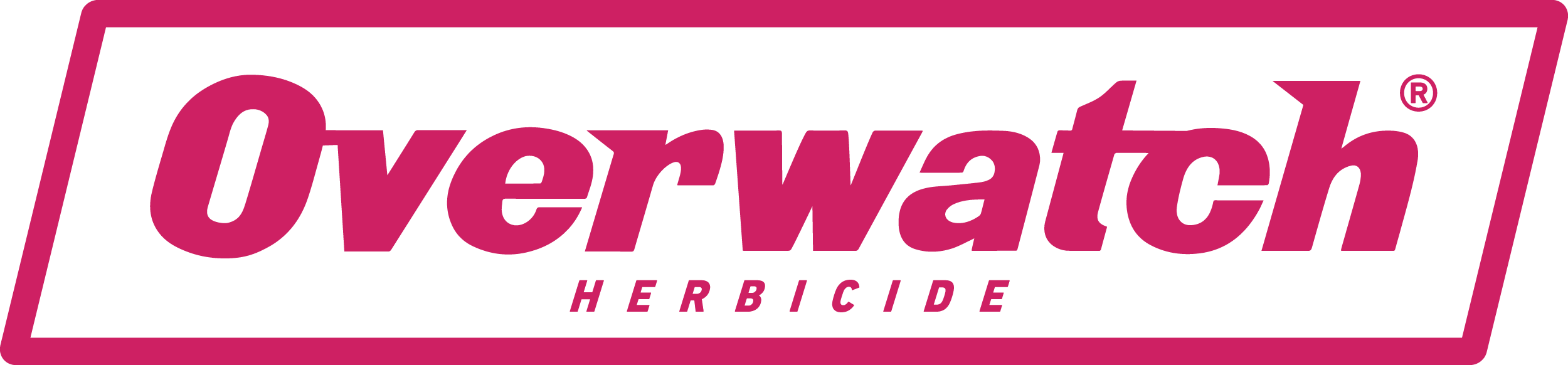
FMC: OVERWATCH®

FMC needed to name, brand and launch a new herbicide into the largest agricultural market in the country; wheat, barley and canola. The brand identity we created also needed to have global relevance.
-
Let's start where it ended...
The ending was nothing short of spectacular. FMC sold out the first allocation of product - three times the budgeted amount. This marked the most successful launch in FMC’s global history.
Our multi-channel marketing campaign delivered remarkable results, reaching 98% of our target market. By the time Overwatch was available, not only had they heard of it, but they also understood the value it would bring to their farming operations. There was no ambiguity about what Overwatch was. Our negotiated media spots provided more than triple the value we paid for.
Over the course of the next three years we continued to evolve the campaign to maintain market traction.
Now, let’s dive into the how it all began...
Positioning
We conducted an in-depth analysis of market competitors, both in Australia and abroad, as well as successful agricultural and challenger campaigns worldwide. The majority of advertising in this space was uninspired—pale, male, and stale. The typical imagery of an aging white male in a paddock, standing behind a ute with a drum and a dog, was outdated. We needed a more relevant and modern approach.
Naming
We sought a name that communicated the product’s benefits—watching over a farmer’s largest investment. It needed to resonate with our target market and work across multiple languages. Additionally, it had to be globally ownable. After considering a shortlist of over 20 names, we recommended Overwatch® Herbicide, which was approved by the global marketing and brand team.
Brand Identity
Our brand identity had to reflect both the product and its outcomes. Overwatch creates a distinctive magenta hue in treated crops due to its signature bleaching effect. We chose this magenta as the brand’s primary color to ensure in-paddock and on-shelf recognition.
This insight also inspired our campaign tagline: See the difference in the paddock. The tagline highlights the visual signature, superior efficacy, higher yield, and the new mode of action that addresses resistance, particularly in ryegrass.
To modernize the conversation and reflect the diversity of contemporary Australian farming, we featured a strong female agronomist and a younger farmer in all campaign assets. The black-and-white images, accented with magenta blocks of color and creative hand symbols, were designed to disrupt the market, grab attention, and cut through the cluttered conversation.
Campaign
Launching a new agricultural product involves long lead times—registration and approval are required before selling can begin. However, waiting until then to build a brand would have jeopardized the success of launching a new product in the same season. Farmers needed a reason to trust that this new product would work.
Our approach was three-phased:
Teaser Campaign
Registration Announcement
Buy Now
Marketing Strategy & Media Buying
Our strategy and media buying approach centered on three key objectives:
Launch with Impact: As a new product, we needed to ensure our target market knew about Overwatch® Herbicide before the key sales period. We bought media across six channels (Regional TV, Regional Radio, Google AdWords, YouTube, Facebook, and Twitter) and aggressively promoted the product’s unique selling points. This ensured our media hit very specific regions at the right times, ahead of the key sales period.
Convert Pre-Registrations into Sales: To turn mass market awareness into sales over 12 months, we partnered with FMC to ensure a seamless onboarding experience—from initial product awareness to pre-registration, and finally, to product availability in the market. This process was designed to be engaging, consistent, and deeply informative.
Enhance FMC’s Brand Recognition and Recall: Running such a large campaign across multiple channels, including TV, significantly improved FMC’s brand reputation and recall. To capitalize on this increased awareness and traffic, we included a series of brand posts on social media to highlight FMC’s history and values.
Services Provided: Channel strategy, media schedule negotiation, production and delivery of assets to all partners, as well as ongoing monthly reporting and optimization of schedules to ensure maximum value.
“Having Emerger partner with us has been invaluable. Their seniority, expertise and ability to deliver outcomes to our business is second to none. They have partnered with us on the delivery of our biggest product launch in history and in doing so have been proactive and gone above and beyond to work within our timeframes and sometimes complex international requirements. We will continue to work with Emerger for many years to come.”
So much pink!!! We needed to make the identity relevant to the product and the outcome. Overwatch created signature bleaching within a crop, creating a magenta hue in treated crops so we decided to use this as a primary colour for the brand to drive recognition in paddock and on the shelf. That same insight also led to our campaign tagline: see the difference in the paddock.


